Random Meadow Run
Date:I am enjoying the end of the year 2021 in Cambridge, hosted as a visiting fellow at the McDonald Institute for Archaelogical Research. For an article I am about to submit, I need a situation map showing where the Karabel relief is located. A perfect occasion to use OpenStreetMap data with R, but it demands to create a static exhibit. Eventually, I found myself mapping my last run instead of working on the situation map. It was more compelling this way to learn the how-tos and to go through the documentation of the different packages. In short, this post is about how I (mis)used the osmdata package combined with sf and ggplot2 to make a quick map of dummy data. It starts with the loading of running data undergoing some data wrangling. This will give us some stats to add to the plot, such as the distance covered or the pace. Then it goes to import OSM data and how to plot everything together via sf+ggplot2.
Set-up
Load the packages (“stopifnot installed”)
library(sf)
library(osmdata)
library(ggplot2)
library(magrittr) # I love the pipe %>%
library(jsonlite) # Read the running file
library(scales)   # For the function scales::ordinal()
I import some colour keys for the plot from my file def_colours.R. Colour keys are stored in a separate file so it is easier to reuse. I tried to make colour names meaningful, so I may remember them. It happens to be a reccurent problem to me….
source("../R_scripts/def_colours.R")We will need some running
data.
Originally, my trace was recorded with a GPS device,
but I am logging my runs and biking trips with
GoldenCheetah. It is
free software, and you can use it offline (for me, this
means owning your data). I used the export function to
JSON that I can now import into the object result.
run_file <- "../media/2021-11-27_goldencheetah_export.json"
result <- fromJSON(run_file)
Now, that we imported the object ride into R, let us keep
only the main data.frame, called “SAMPLES”:
ride <- result$RIDE$SAMPLESIt has the following variables: SECS, KM, KPH, ALT, LAT, LON, SLOPE, TEMP. For convenience, I withdraw some data and do some formatting
## Date & Time
ride_start  <- as.POSIXct(result$RIDE$STARTTIME)
ride_start_day <- format(ride_start, format="%B %d (%Y)")
ride_start_hour <- format(ride_start, format="%H:%M")
# Temperature
ride_mean_t <- paste0(round(mean(ride$TEMP, na.rm = TRUE), 2), "°C")
# IDs
ride_athtlete <- result$RIDE$TAGS$Athlete
ride_sport <- result$RIDE$TAGS$Sport
And I transform the ride data.frame into sf
ride <- ride[ride$LAT>0 & ride$LON>0,] # Filter missing data
ride <- st_as_sf(ride, coords=c("LON","LAT"))
st_crs(ride) = 4326
In the first version of the map, I plotted the distance covered
every 10 minutes and created e10m . Then I changed my mind and
wanted to plot my pace for every kilometre. In both cases, I
create directly a label in a variable LABEL.
# Every 10min (kept a record, but not used in the plot)
e10m <- c(seq(1, max(ride$SECS),600))
e10m_distance <- ride[ride$SECS %in% e10m,"KM"]
e10m_distance$LABEL <- paste0(
     round(e10m_distance$KM, 1), "km in ", round(e10m/60,0), "min")

# Every 10k
seq_km <- 1:max(ride$KM)
seq_km_ordi <- scales::ordinal(seq_km)

# Match every (rounded) kilometre and
pek <- ride[round(ride$KM,1) %in% seq_km, ]
# Delete duplicate (take first of km)
pek <- pek[!duplicated(round(pek$KM,1)),]
pek$LABEL <- paste0(
     seq_km_ordi,
     " k pace\n ",
     round(c(pek$SECS[1]/60, diff(pek$SECS)/60), 1),"min/km")
This will give label such as “1st k pace 5.8min/km” (meaning the pace for the 1st kilometre).
Take it on line
The data are recorded as a series of points for every second, but we want to plot the ride as a continuous line, and we keep only the coordinates.
# Make it a line
ride_line <- st_sf(st_sfc(st_linestring(st_coordinates(ride))))
st_crs(ride_line) = 4326
With the line, it is easy to compute the length of the ride and from there the average speed
ride_distance <-  st_length(ride_line)
ride_distancek  <-
  paste0(round(ride_distance/1000, 2), "km")
ride_average_speed <-
  paste0(round(
          (ride_distance/1000) /
(max(ride$SECS)/3600),2), "km/h")ride_average_speed? 9.71km/h? Not too bad. Now, the data of the ride
are ready, we will need to get geographical information.
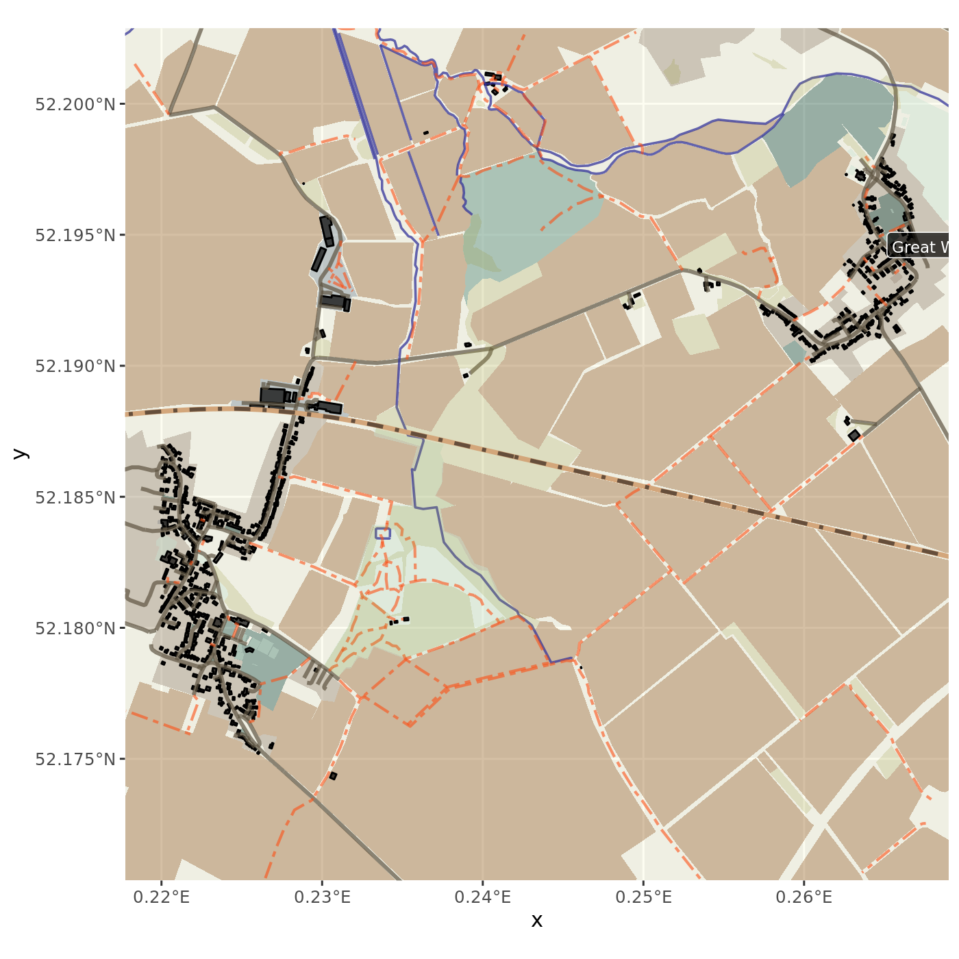
Using osmdata
With osmdata, the most convenient way I found to access the OSM data was
first to download the data from the area of my ride and then to extract
features. I create different objects mimicking a layer paradigm for the
plot.
Where did I run? We compute the bounding box for the plot by expanding of 15% the limit of the ride bounding box
ride_box <- st_bbox(ride_line)

# I created a function, it is a task I already did earlier
expand_box <- function(bbox_obj, percentage) {
  to_x <- diff(bbox_obj[c("xmin","xmax")])*percentage
  to_y <- diff(bbox_obj[c("ymin","ymax")])*percentage
  bbox_obj[c("xmin")] <- bbox_obj[c("xmin")] - to_x
  bbox_obj[c("xmax")] <- bbox_obj[c("xmax")] + to_x
  bbox_obj[c("ymin")] <- bbox_obj[c("ymin")] - to_y
  bbox_obj[c("ymax")] <- bbox_obj[c("ymax")] + to_y
  return(bbox_obj)
}
ride_box <- expand_box(ride_box, 0.15)
Now I use the box to download the OSM data within the box
query_box  <- ride_box  %>% opq(bbox = .)

q <- query_box %>% osmdata_sf ()
This object contains various geometries (points, lines,
polygons, and more). The aim of the next chunk of code
is to extract the different elements into different
objects. I create a convenient function cull_osm to
delete empty (NAs) column when a specific feature is
subset (copy-paste from mnel posted on
SO).
It does not bring anything, but I prefer to have neat
data.
cull_osm <- function(osm_subset){
  Filter(function(x)!all(is.na(x)), osm_subset)
}

boundaries <- q$osm_multipolygons %>%
  subset(type=="boundary") %>% cull_osm


farmlands <- q$osm_polygons %>%
  subset(landuse=="farmland") %>% cull_osm

meadows <- q$osm_polygons %>%
  subset(landuse %in% c("meadow","grass","recreation_ground"))%>% cull_osm

residentials <- q$osm_polygons %>%
  subset(landuse %in% c("residential","allotments")) %>% cull_osm

industrials <- q$osm_polygons %>%
  subset(landuse %in% c("industrial","commercial")) %>% cull_osm

leisure <- q$osm_polygons %>%
  subset(!is.na(leisure))%>% cull_osm

buildings <- q$osm_polygons %>%
  subset(!is.na(building)) %>% cull_osm

naturals <- q$osm_polygons %>%
  subset(!is.na(natural)) %>% cull_osm

waterways <- q$osm_lines %>%
  subset(!is.na(waterway))%>% cull_osm

routes  <-q$osm_multilines %>%
  subset(type=="route") %>% cull_osm

highways <- q$osm_lines %>%
   subset(highway %in%
          c("tertiary","residential","service")) %>% cull_osm

footways <- q$osm_lines   %>%
  subset(highway %in% c("footway","bridleway",
                        "track","path")) %>% cull_osm

railways <- q$osm_lines %>%
   subset(railway %in% c("rail")) %>% cull_osm

# `osmdata` downloads the features inside the bbox. I was
# looking for a way to get some geographical names. I tried
# to crop the administrative boundaries, to plot the label
# using the centroid of each features
#     boundaries <- st_crop(boundaries, st_bbox(ride_box))
# but I finally took the points with a place name

names <- q$osm_points %>%
  subset(!is.na(place)) %>% cull_osm
From there, I do a dummy stack of the features with specific colouring and sizing, adding a minimum of labels and some info
ggmap_random_meadow_run <-
  ggplot(data=result$RIDE$SAMPLE) +
  geom_sf(data = boundaries,
          fill = yellow_endive, color = "transparent",
          alpha = 0.3) +
  geom_sf(data = industrials,
          fill = grey_slate, color = "transparent",
          alpha = 0.4) +
  geom_sf(data = residentials,
          fill = grey_conglomerate, color = "transparent",
          alpha = 0.4) +
  geom_sf(data = meadows,
          fill = green_meadow, color = "transparent",
          alpha = 0.4) +
  geom_sf(data = farmlands,
          fill = brown_farmland, color = "transparent",
          alpha = 0.4) +
  geom_sf(data = leisure,
          fill = green_leisure, color = "transparent",
          alpha = 0.4) +
  geom_sf(data = buildings,
          fill = "black", color = "black",
          alpha = 0.7) +
  geom_sf(data = highways,
          color = grey_highway,
          alpha = 0.7, size = 1) +
  geom_sf(data = waterways,
          colour = blue_waterway,
          alpha = 0.75, size = 0.6) +
  geom_sf(data = footways, colour = orange_baseball,
          size = 0.7, lty = "twodash", alpha = 0.6) +
  geom_sf(data = naturals, fill = green_nature,
          alpha = 0.2,  size = 0) +
  geom_sf(data = railways, colour = brown_rail,
          alpha = 0.99, size = 1.2) +
  geom_sf(data = railways, colour = brown_split_rail,
          alpha = 0.91, size = 1,
          lty = "dotdash") +
  geom_sf_label(data = names,
                aes(label = name), alpha = 0.7,
               hjust = 0.0, vjust = 0, fill = "black",
               col = "white", size = 2.9) +
  xlim(st_bbox(ride_box)[c(1,3)]) +
  ylim(st_bbox(ride_box)[c(2,4)])
Let’s have a preview of the data
Ok, it is time to add the layers with the ride trace and the stats. I am changing the theme and the general layout, but this is only to improve my ggplot grammar by training.
ggmap_random_meadow_run +
  geom_sf(data = ride_line,
          colour = "black",
          size = 1.8, alpha = 0.9) +
  geom_sf(data = ride_line,
          colour = yellow_ride,
          size = 1.5, alpha = 1) +
  #geom_sf(data = e10m_distance,
  #        colour = yellow_ride,
  #        fill = orange_baseball,
  #        size=5.6, pch=21, alpha=0.9) +
  #   geom_sf_text(data=e10m_distance, aes(label=KM)) +
  geom_sf_label(data = pek,
                aes(label = LABEL),
                fill = yellow_brown_palette(nrow(pek)),
                size = 2.9, alpha = 0.9, hjust = -0.1,
                vjust = 1) +
  geom_sf(data = pek,
          colour = "black",
          fill = bleu_de_france,
          size = 1.8, pch = 21, alpha = 0.8) +
  geom_sf_label(data = ride[1,],
                aes(label = "Start"),
                    fill = "#ffcccc",
                alpha = 0.9) +
  labs(title = paste("Map of the", (ride_sport),
                     "Enjoyed", ride_start_day),
    subtitle = paste("Started at", ride_start_hour,
                     "for a distance of", ride_distancek,
                     "by", ride_mean_t),
     caption = paste("Data: OpenStreetMap","/",
                     "Software:", "R+osmdata+sf+ggplot2", "/",
                     "Author:", "Néhémie")
  ) +
   geom_text(data=data.frame(),
             aes(label = paste0("Average speed:",
                                ride_average_speed),
                 x = Inf,
                 y = -Inf),
                 hjust = 1.01,
                 vjust = -0.2) +
  ylab("") +
  xlab("")+
  theme_minimal() +
         theme(axis.text = element_text(angle = 45,
                                           vjust = 0.5,
                                           hjust = 1,
                                           colour = "grey"),
               axis.title.x = element_text(angle = 0,
                                           vjust = 0.5,
                                           colour = "grey"),
               axis.title.y = element_text(angle = 0,
                                           vjust = 0.5,
                                           colour = "grey"),
    ### Background
    plot.background = element_rect(fill = "#f8f8f8",
                                   colour = "#f9f9f9"),
    panel.background =
      element_rect(fill = white_paper,
                   colour = white_paper_border,
                   size = 0.5, linetype = "solid"),
    panel.grid.major =
      element_line(size = 0.1,
                   linetype = 'dashed',
                   colour = white_paper_border),
    panel.grid.minor =
      element_line(size = 0.25,
                   linetype = 'solid',
                   colour = "black")
         ) # Done!
I am not convinced with this plot, but I think it is a decent start.
Testing replicability
When I was writing these lines, I thought I should go and record another run to see how my code performs. Originally, I wanted to run the same track, but I lost myself and I did a slightly different route. Well, it’s probably better for the replicability (and not only the reproducibility of the experiment). This next map is the result if you run (ahem) the code presented above (script here), only by swapping the data exported from GoldenCheetah.
source("../R_scripts/2021-12-02_plot_my_run.R")

plot_my_run("../media/2021-12-02_goldencheetah_export.json")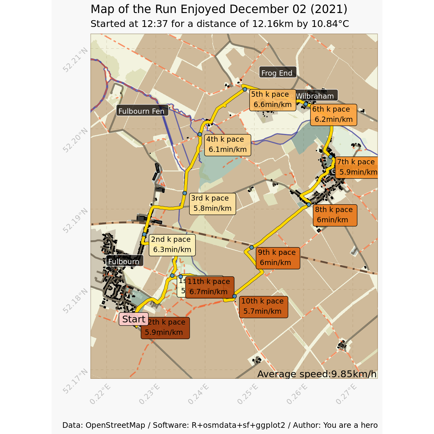
Well, a lot of overlays. The key takeaway from this exercise is obviously that I should not circuit! Or being faster at it… Otherwise, if the map is static (a requirement for the situation map I want to do), reducing the amount of text and put the kilometres (1st, 2nd, 3rd) into the point. Likewise, for circuit, I should change the orientation of the label (not too difficult to orient them according to the location in the map: left goes left, top goes up, and so on). At least, there is room for improvement in my running, orientation, and coding skills!