"This post was written as a practice exercise to improve my plotting skills in R."On August 4th, the Federal Statistical Office of Germany published a press release in English on the development of labour supply in Germany (lengthier version in German here).
The main point is that when the “baby boomer generation” (born between 1957 and 1969) will be retired (by 2036, i.e. during the next 15 years) they will not be replaced in equal numbers by younger people on the job market (with the same system and under current evolution). To expose the underlying data − “Labour force participation by age groups” provided by “GENESIS-Online database” − this point in the press release was explained with a population pyramid. To train my ggplot2 skills, I wanted to reproduce it.
This is my take:
Show the code of the exhibit
library(forcats)
library(ggplot2)
library(dplyr)

lf <- read.csv2("2022-08-09--labour-force-participation_12211-0001.csv", encoding = "latin1",na.strings = c("x"))


# Make sense of column names
lf <- lf |>
   select(Zeit,
          sex = X2_Auspraegung_Label,
          group = X3_Auspraegung_Code,
          contains("ERW04"))  |>
   rename_with(~ tolower(gsub("_aus_Hauptwohnsitzhaushalten__1000",
                              "", .x, fixed = TRUE))) |>
   rename_with(~ gsub("erw043__", "", .x, perl = TRUE)) |>
   rename_with(~ gsub("erw042__", "", .x, perl = TRUE)) |>
   rename_with(~ gsub("erw041__", "", .x, perl = TRUE))

# Change value
lf <- lf |>
  mutate(erwerbslose = as.integer(gsub("/", "0", lf$erwerbslose)))

lf <- lf |>
  select(-erw040__erwerbspersonen) |>
  dplyr::filter(sex != "Insgesamt") |>
  dplyr::filter(group != "") |>
  dplyr::filter(group != "ALT000B15") |>
  dplyr::filter(group != "ALT075UM") |>
  mutate(sex = fct_recode(sex, m = "männlich", w = "weiblich" )) |>
  mutate(group = fct_recode(group,
                            "15-19" = "ALT015B20",
                            "20-24" = "ALT020B25",
                            "25-29" = "ALT025B30",
                            "30-34" = "ALT030B35",
                            "35-39" = "ALT035B40",
                            "40-44" = "ALT040B45",
                            "45-49" = "ALT045B50",
                            "50-54" = "ALT050B55",
                            "55-59" = "ALT055B60",
                            "60-64" = "ALT060B65",
                            "65-69" = "ALT065B70",
                            "70-74" = "ALT070B75"))

lf <- lf |>
  tidyr::pivot_longer(4:6, names_to = "labour", values_to = "count_m")
lf <- lf |>
  mutate(count_m = count_m/1000) |>
  mutate(labour_s = paste0(labour," (", sex, ")")) |>
  mutate(labour_s = factor(labour_s,
                    levels = rev(c("erwerbstaetige (m)",
                                   "nichterwerbspersonen (m)",
                                   "erwerbslose (m)",
                                   "erwerbstaetige (w)",
                                   "nichterwerbspersonen (w)",
                                   "erwerbslose (w)"
                               )))) |>
select(-labour)
#   mutate(labour = fct_recode(labour,
#         "Labour force" = "erwerbstaetige",
#         "Other economically inactive people"=  "nichterwerbs",
#         "Economically inactive people undergoing education" = "erwerbslose"))

{
ggplot(data = lf,
       mapping = aes(x = count_m,
                     y = group,
                     fill = labour_s)) +
 geom_col(data = filter(lf, sex == "m"),
          mapping = aes(x = -count_m), width = 0.4) +
 geom_col(data = dplyr::filter(lf, sex == "w"),
           mapping = aes(x = count_m), width = 0.4) +
 scale_fill_manual(values = c("erwerbstaetige (m)" = "#2979b9",
                       "nichterwerbspersonen (m)"  = "#123b5c",
                       "erwerbslose (m)"           = "#449ad0",
                       "erwerbstaetige (w)"        = "#ed6174",
                       "nichterwerbspersonen (w)"  = "#923440",
                       "erwerbslose (w)"           = "#f7bec6") ) +
  scale_x_continuous(breaks = -3:3, labels = c(3:1,0,1:3)) +
  labs( fill = "", y = "", x = "",
        title = "Educational and labour force participation of the population, 15 to 79 years, by age and sex, 2021",
        subtitle = "Millions",
         caption = "Results of the 2021 microcensus") +
# geom_vline(xintercept = 0)+
  theme(rect = element_rect(fill = NULL, linetype = 0, colour = NA),
               text = element_text(size = 12, family = "sans"),
               plot.margin = unit(c(1,1,1,1), "lines"),
               axis.title.x = element_blank(),
               axis.title.y = element_blank(),
               axis.line.x = element_line(colour = "black",
                                            size = 0.5,),
               axis.ticks.y = element_line(size = 0),
               axis.text.y = element_text(hjust = 0),
               panel.grid.major.y = element_blank(),
               panel.grid.minor.y = element_blank(),
               panel.grid.major.x = element_line(color = "grey90",
                                        size = 0.5,
                                        linetype = 1),
               panel.grid.minor.x = element_blank(),
               panel.background = element_blank(),
               plot.title.position = "plot",
               plot.title = element_text(hjust = 0, face = "bold"),
               plot.caption.position = "plot",
               plot.caption = element_text(hjust = 0),
    legend.position = "bottom",
    legend.justification = "right",
    legend.direction = "vertical",) +
  guides(fill = guide_legend(ncol = 1, bycol = TRUE))
}

ggsave("2022-08-09--labor_force.jpg",
       width = 12,
       height = 8,
       bg = "white",
       dpi = 60)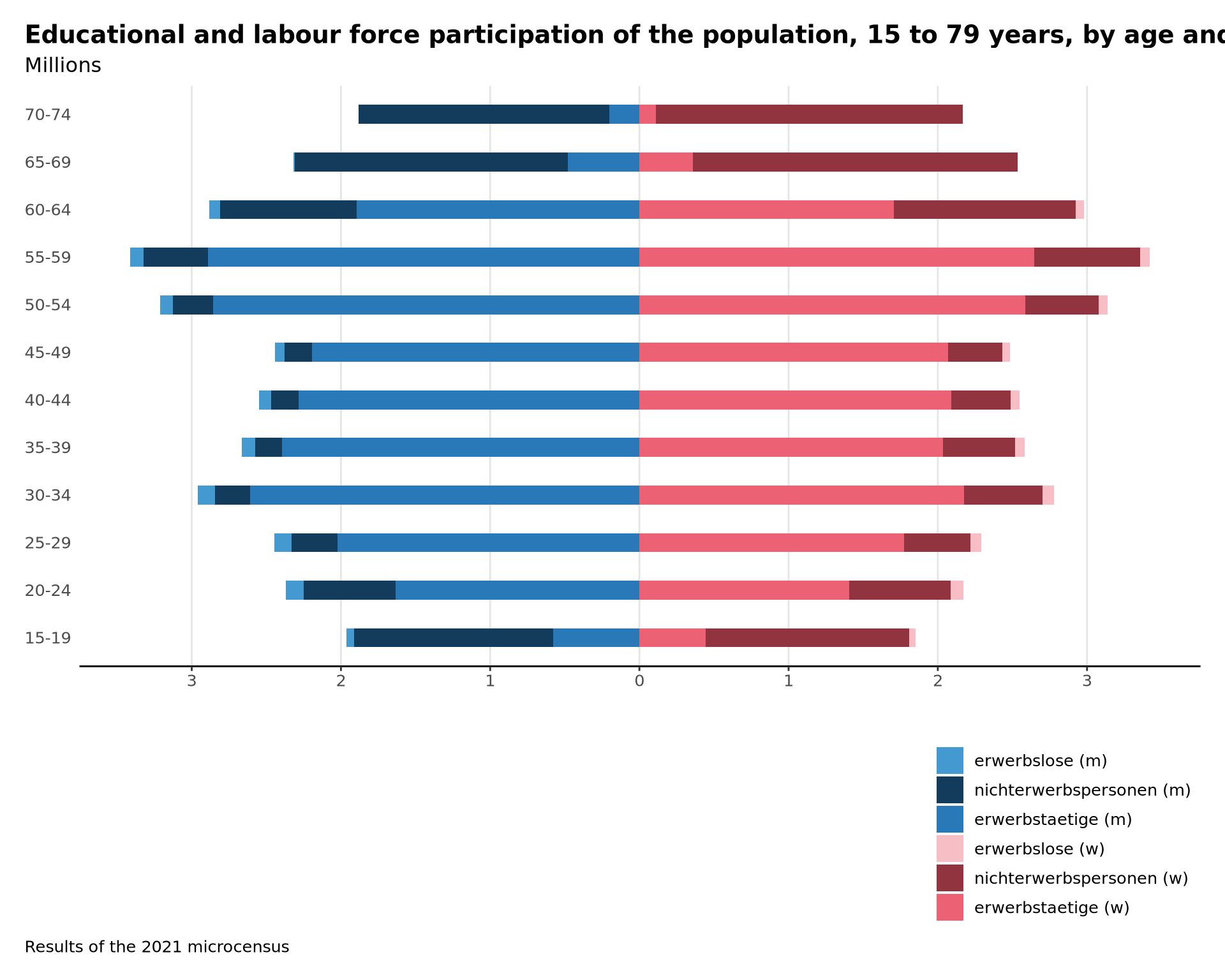
The original below shows that they are some differences. I couldn’t determine the same labour classes: I am missing the upper class. However this has more to do with the data provided and how it was manipulated rather than my ggplot2 skills. The data-set linked provides data only for a class 75+ (and not limited to 80) and there is no mention of “undergoing education” too.
Anyway, even if it is not a perfect replication, I achieved my training goals for today.
